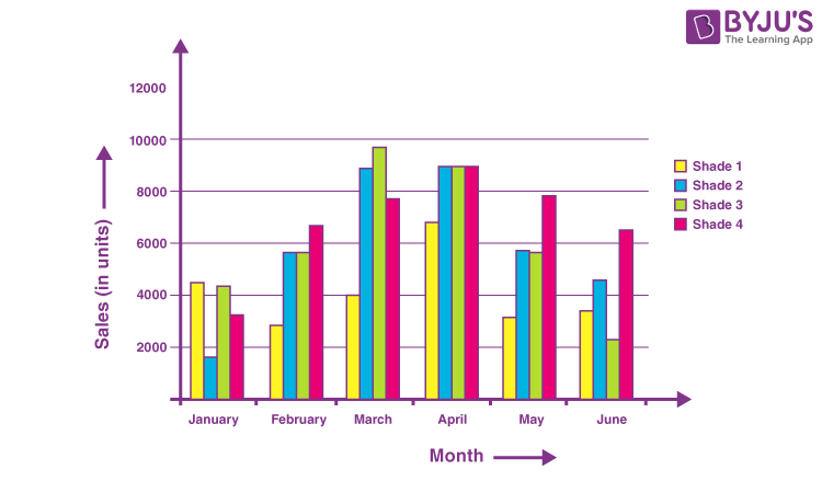
Know How to Create Graphs and Types like Line and Horizontal Bar Graph Here

A horizontal bar graph is a graph with horizontally running rectangular bars. It’s a type of data visualization. These bars are proportional in length to the values they represent. The title of the bar chart specifies which data is being displayed. The horizontal axis shows a value, while the vertical axis represents the categories being compared. This type of graph depicts categorical data in a visual manner. This information is bundled together.
Months of the year, age ranges, shoe sizes, and animal species are all examples. To make a horizontal bar graph, start by deciding on a scale that is acceptable for the data values. Then, on the vertical axis, label the data categories, and on the horizontal axis, label the values. After that, each data category’s bands should be drawn.
A line graph is a form of a graph that shows data that changes over time. Straight lines are used to link many points in a line graph. A line chart is another name for it. A line graph is made up of two axes: the ‘x-axis and the ‘y’ axis.
- The x-axis refers to the horizontal axis.
- The y-axis refers to the vertical axis.
Plotting a Line Graph
- Draw the x- and y-axes on graph paper. Make careful to write the title above the table so that the graph’s objective is evident.
- For example, if one of the components is time, it is shown on the x-axis, which is the horizontal axis. The y-axis, or vertical axis, would then be plotted with the other factor. Both axes should be labeled according to their respective factors. The x-axis can be labeled as time or day, for example.
- Then, on the graph, highlight the exact values using the previously provided data. You may form a clear conclusion about the trend after connecting the points.
Reading a Line Graph
- Take a look at the two axes and try to figure out what they represent.
- Then have a look at the graph and the values of the points on the graph’s lines.
- By following the lines, you can determine whether there is a rise or fall. Also, see if there are any repeating patterns or lines that cross each other.
- It’s also likely that you’ll see new patterns that can help you forecast the trend.
Line Graph Advantages
The advantages of using line graphs are as follows.
- It’s useful for displaying changes and trends over time.
- Small changes that are difficult to measure in other graphs can also be shown.
- Because they are straightforward, easy to understand, and efficient, line graphs are popular and successful charts.
- Anomalies within and across data sets can be usefully highlighted.
- As a comparison, more than one line can be plotted on the same axis.
Line Graph Disadvantages
- Too many lines plotted over the graph make it cluttered and difficult to read.
- It’s difficult to plot a wide range of data on a line graph.
- They are only suitable for displaying data with numerical values and total numbers, such as monthly rainfall totals.
- The data in a line graph may appear wrong if consistent scales on the axis are not applied.
- Line graphs are sometimes problematic when plotting fractions or decimal quantities.
Reading a Horizontal Bar Graph
- The data that the horizontal bar graph shows is described in the title.
- On the vertical axis, the data categories are depicted. The colors indicate the data categories in this case.
- The values corresponding to each data value are represented on the horizontal axis. The data values here are the number of pupils who favor each of the colors on the vertical axis.
- On the horizontal axis, the scale displays the value of one unit.


